

By: Richard J. Wright | Gulag Bound

In Infections and Fatalities, I wondered why there is absolutely no discernible change in the cumulative U.S. Deaths curve to reflect the effect of the shutdown. Here’s a zoomed-in look at curve 5 which perfectly fit the data until everyone started inflating the data at the CDC’s request as I pointed out in Changing Lanes:
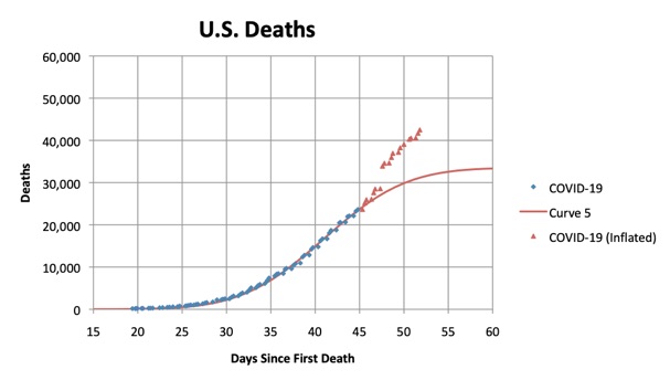
How can it be that shutting off the American economy and locking people in their homes made no effect on the curve at all? Regardless of how effectively people have followed the guidelines, no one can possibly believe that this has not been a monumental change in everyday life.
So I decided to look at the Flu Surveillance data in Cook County, Illinois where I live. (“ED Visits” means emergency department visits, where flu-like symptoms are denoted.)
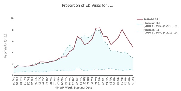
There are the 3 peaks that Dr. Birx likes to talk about. The first is Influenza B, the second is Influenza A and the third is COVID-19. Sure enough, the peak of COVID-19 coincides with the shutdown, taking into account the 5-7 day incubation period. But notice how that peak looks just like the other two where there were no associated shutdowns. The upward and downward slopes look the same as do the widths of the peaks. So, if the shutdown is responsible for the downward slope in the last peak, what was responsible for the downwards slopes in the first two flu outbreaks?
The national flu-like symptoms surveillance chart looks the same:
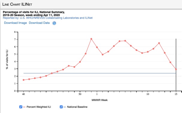
I think we have very good reason to believe that the shutdown has had no measurable effect at all and that this virus is just going through the same pattern as the seasonal flu.
Richard J. Wright, a chemist and information technology specialist, has been tracking the official COVID-19 (Corona-SARS) data and assessing our government’s disease progression modeling, plus responses, at virtualwright.com.